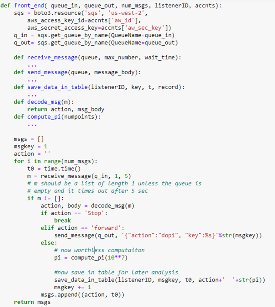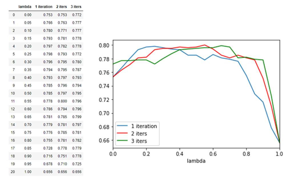
AutoML
AI is the hottest topic in the tech industry. While it is unclear if this is a passing infatuation or a fundamental shift in the IT industry, it certainly has captured the attention of many. Much of the writing in the popular press about AI involves wild predictions or dire warnings. However, for enterprises and researchers the immediate impact of this evolving technology concerns the more prosaic subset of AI known as Machine Learning. The reason for this is easy to see. Machine learning holds the promise of optimizing business and research practices. The applications of ML range from improving the interaction between an enterprise and its clients/customers (How can we better understand our clients’ needs?), to speeding up advanced R&D discovery (How do we improve the efficiency of the search for solutions?).
Unfortunately, it is not that easy to deploy the latest ML methods without access to experts who understand the technology and how to best apply it. The successful application of machine learning methods is notoriously difficult. If one has a data collection or sensor array that may be useful for training an AI model, the challenge is how to clean and condition that data so that it can be used effectively. The goal is to build and deploy a model that can be used to predict behavior or spot anomalies. This may involve testing a dozen candidate architectures over a large space of tuning hyperparameters. The best method may be a hybrid model derived from standard approaches. One such hybrid is ensemble learning in which many models, such as neural networks or decision trees, are trained in parallel to solve the same problem. Their predictions are combined linearly when classifying new instances. Another approach (called stacking) is to use the results of the sub-models as input to a second level model which selects the combination dynamically. It is also possible to use AI methods to simplify labor intensive tasks such as collecting the best features from the input data tables (called feature engineering) for model building. In fact, the process of building the entire data pipeline and workflow to train a good model itself a task well suited to AI optimization. The result is automated machine learning. The cloud vendors have now provided expert autoML services that can lead the user to the construction of a solid and reliable machine learning solutions.
Work on autoML has been going on for a while. In 2013, Chris Thornton, Frank Hutter, Holger H. Hoos, and Kevin Leyton-Brown introduced Auto-WEKA and many others followed. In 2019, the AutoML | Home research groups led by Frank Hutter at the University of Freiburg, and Prof. Marius Lindauer at the Leibniz University of Hannover published Automated Machine Learning: Methods, Systems, Challenges (which can be accessed on the AutoML website).
For an amateur looking to use an autoML system, the first step is to identify the problem that must be solved. These systems support a surprising number of capabilities. For example, one may be interested in image related problems like image identification or object detection. Another area is text analysis. It may also be regression or predictions from streaming data. One of the biggest challenges involve building models that can handle tabular data which may be contain not only columns of numbers but also images and text. All of these are possible with the available autoML systems.
While all autoML systems are different in details of use, the basic idea is they automate a pipeline like the one illustrated in Figure 1 below.

Figure 1. Basic AutoML pipeline workflow to generate an optimal model based on the data available.
Automating the model test and evaluation is a process that involves exploring the search space of model combinations and parameters. Doing this search is a non-trivial process that involves intelligent pruning of possible combinations if they seem like to be poor performers. As we shall show below, the autoML system may test dozens of candidates before ranking them and picking the best.
Amazon AWS, Micosoft Azure, Google cloud and IBM cloud all have automated machine learning services they provide to their customers. In the following paragraphs we will look at two of these, Amazon AWS autoGluon which is both open source and part of their SageMaker service, and Microsoft Azure AutoML service which is part of the Azure Machine Learning Studio. We will also provide a very brief look at Google’s Vertex AI cloud service. We will not provide an in-depth analysis of these services, but give a brief overview and example from each.
AWS and AutoGluon
AutoGluon was developed by a team at Amazon Web Services which they have also released as open source. Consequently, it can be used as part of their SageMaker service or complete separately. An interesting tutorial on AutoGluon is here. While the types of problems AutoGluon can be applied to is extremely broad, we will illustrate it for only a tiny classical problem: regression based on a tabular input.
The table we use is the Kaggle bike share challenge. The input is a pandas data frame with records of bike shares per day for about two years. For each day, there is an indicator to say if this is a holiday and a workday. There is weather information consisting of temperature, humidity and windspeed. The last column is the “count” of the number of rentals for that day. The first few rows are shown below in Figure 2. Our experiment differs from the Kaggle competition in that we will use a small sample (27%) of the data to train a regression model and then use the remainder for the test so that we can easily illustrate the fit to the true data.

Figure 2. Sample of the bike rental data used in this and the following example.
While AutoGluon, we believe, can be deployed on Windows, we will use Linux because it deploys easily there. We used Google Colab and Ubuntu 18.04 deployed on Windows 11. In both cases the installation from a Jupyter notebook was very easy and went as follows. First we need to install the packages.

The full notebook for this experiment is here and we encourage the reader to follow along as we will only sketch the details below.
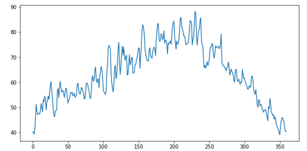
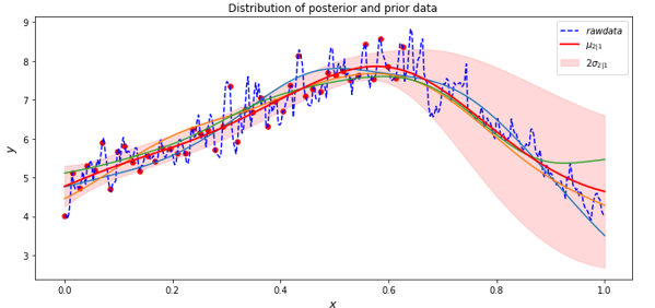
As can be seen from the data in Figure 2, the “count” number jumps wildly from day to day. Plotting the count vs time we can see this clearly.

A more informative way to look at this is a “weekly” average shown below.

The training data that is available is a random selection about 70% of the complete dataset, so this is not a perfect weekly average, but it is seven consecutive days of the data.
Our goal is to compute the regression model based on a small training sample and then use the model to predict the “count” values for the test data. We can then compare that with the actual test data “count” values. Invoking the AutoGluon is now remarkably easy.

We have given this a time limit of 20 minutes. The predictor is finished well before that time. We can now ask to see how well the different models did (Figure 3) and also ask for the best.

Running the predictor on our test data is also easy. We first drop the “count” column from the test data and invoke the predict method on the predictor


Figure 3. The leaderboard shows the performance of the various methods tested
One trivial graphical way to illustrate the fit of the prediction to the actual data is a simple scatter plot.

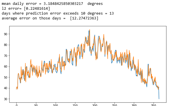
As should be clear to the reader, this is far from perfect. Another simple visualization is to plot the two “count” values along the time axis. As we did above, the picture is clearer if plot a smoothed average. In this case each point is an average of the following 100 points. The results, which shows the true data in blue over the prediction in orange, does indicate that the model does capture the qualitative trends.

The mean squared error is 148. Note: we also tried training with a larger fraction of the data and the result was similar.
Azure Automated Machine Learning
The azure AutoML system is also designed to support classification, regression, forecasting and computer vision. There are two basic modes in which Azure autoML works: use the ML studio on Azure for the entire experience, or use the Python SDK, running in Jupyter on your laptop with remote execution in the Azure ML studio. (In simple cases you can run everything on you laptop, but taking advantage of the studio managing a cluster for you in the background is a big win.) We will use the Azure studio for this example. We will run a Jupyter notebook locally and connect to the studio remotely. To do so we must first install the Python libraries. Starting with Anaconda on windows 10 or 11, it can be challenging to find the libraries that will all work together. The following combination will work with our example.
conda create -n azureml python=3.6.13
conda activate azureml
pip install azureml-train-automl-client
pip install numpy==1.18
pip install azureml-train-automl-runtime==1.35.1
pip install xgboost==0.90
pip install jupyter
pip install pandas
pip install matplotlib
pip install azureml.widgets
jupyter notebook
Next clone the Azure/MachineLearningNotebooks from Github and grab the notebook configuration.ipynb. If you don’t have an azure subscription, you can create a new free one. Running the configuration successfully in you jupyter notebook will set up your connection to the Azure ML studio.
The example we will use is a standard regression demo from the AzureML collection. In order to better illustrate the results, we use the same bike-share demand data from the Kaggle competition as used above where we sample both the training and test data from the official test data. The train data we use is 27% of the total and the remainder is used for test. As we did with the AutoGluon example, we delete two columns: “registered” and “casual”.

You can see the entire notebook and results here:
azure-automl/bike-regression-drop-.3.ipynb at main · dbgannon/azure-automl (github.com)
If you want to understand the details, this is needed. In the following we only provide a sketch of the process and results.
We are going to rely on autoML to do the entire search for the best model, but we do need to give it some basic configuration parameters as shown below.

We have given it a much longer execution time than is needed. One line is then used to send the job to Azure ML studio.

After waiting for the experiment to run, we see the results of the search

As can be seen, the search progressed through various methods and combination with a stack ensemble finally providing the best results.
We can now use the trained model to make our predictions as follows. We begin by extracting the fitted model. We can then drop the “count” column from the test file and feed it to the model. The result can be plotted as a scatter plot.


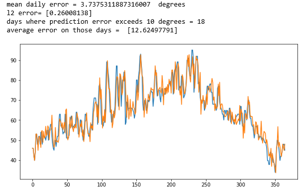
As before we can now use a simple visualization based on a sliding window average of 100 points to “smooth” the data and show the results of the true values against the prediction.

As can be seen the fit is pretty good. Of course, this is not a rigorous statistical analysis, but it does show the model captures the trends of the data fairly well.
In this case the mean squared error was 49.
Google Vertex AI
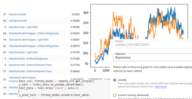
Google introduced their autoML service, called VertexAI in 2020. Like AutoGluon and Azure AutoML there is a python binding where there is a function aiplatform.TabularDataset.create() that can be used to initiate a training job in a manner similar to AutoMLConfig() in the Azure API. Rather than use that we decided to use their full VertexAI cloud service on the same dataset and regression problem we described above.
The first step was to upload our dataset, here called “untitled_1637280702451”. The VertexAI system steps us through the process in a very deliberate and simple manner. The first step is to tell it we want to do regression (the other choice for this data set was classification).

The next step is to identify the target column and the columns that are included in the training. We used the default data slit of 80% for training, 10% validation and 10% testing.

After that there is a button to launch the training. We gave it one hour. It took two hours and produced a model


Once complete, we can deploy the model in a container and attach an endpoint. The root mean squared error if 127 is in line with the AutoGluon result and more than the Azure autoML value. One problem with the graphical interactive view is that I did not see the calculation to see if we are comparing the VeretexAI result to the same result for to the RMSE for the others.
Conclusions
Among the three autoML methods used here, the easiest to deploy was VertexAI because we only used the Graphical interface on the Google Cloud. AutoGluon was trivial to deploy on Google Collab and on a local Ubuntu installation. Azure AutoML was installable on Windows 11, but it took some effort to find the right combination of libraries and Python versions. While we did not study the performance of the VertexAI model, the performance of the Azure AutoML model was quite good.
As it is like obvious to the reader, we did not push these systems to produce the best results. Our goal was to see what was easy to do. Consequently, this brief evaluation of the three autoML offerings did not do justice to any of them. All three have capabilities that go well beyond simple regression. All three systems can handle streaming data, image classification and recognition as well as text analysis and prediction. If time permits, we will follow up this article with more interesting examples.